Home Energy Dashboard
I designed an interactive concept that helps households see where their power comes from, understand what uses it, and make more informed choices about stored energy and backup.
All readings, controls, alerts, history, and savings are sample data. The prototype is not connected to household equipment.
Turn a complex energy system into useful decisions
A home with solar panels, a battery, grid power, and connected devices can change how it is powered throughout the day. A single bill or battery percentage cannot explain what is happening now, which devices matter, or how long backup might last.
I explored a dashboard that brings those answers together. It moves from a clear current state to deeper controls, so people can understand the system before changing a reserve or reducing a load.
My contribution
I defined the concept, designed the dashboard and setup flow in Figma, and directed an AI-assisted implementation of the responsive prototype. I refined the interface, interaction states, and explanations while checking that the sample power flows and backup calculations remained internally consistent.
My Working Process
Map household energy questions → design the overview and setup in Figma → build interactive scenarios → check power balance and responsive states → refine the explanations.
I organized the dashboard around four parts of the system: solar production, home use, battery, and grid. The first view answers what is happening now; scenario controls reveal how that answer changes in daylight, at higher demand, and during an outage. I kept the calculations inspectable so the flow diagram, metrics, and backup guidance tell the same story.
Start with the current energy picture
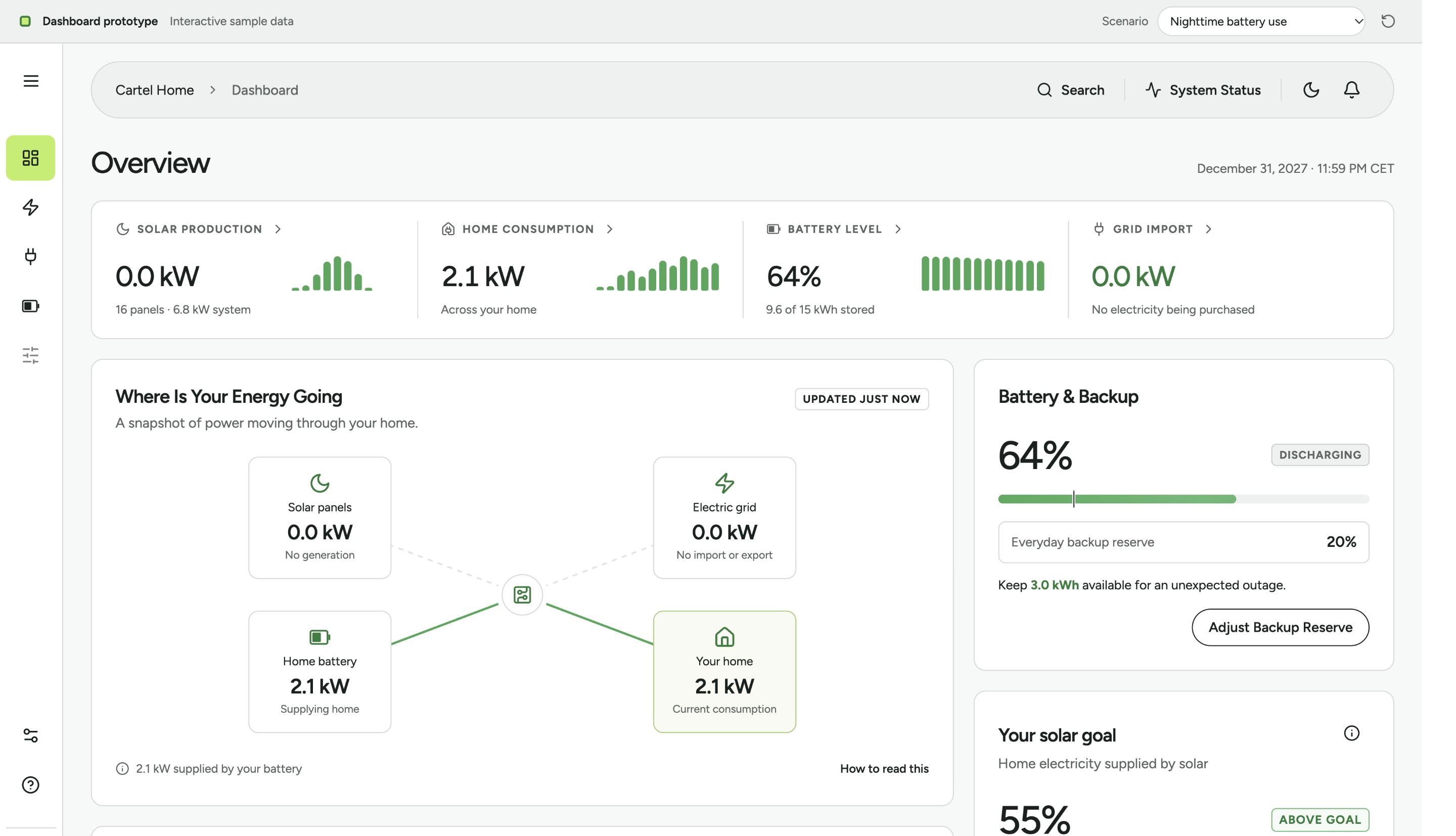
The overview puts solar production, home consumption, battery level, and grid import together. Below, a flow diagram shows which source is supplying the home, while backup and device information stays close to the decision.
In the nighttime scenario, solar is inactive and the battery supplies the sample home's 2.1 kW load. Labels accompany color and motion so the state remains understandable when animation is reduced.
Show where surplus solar goes
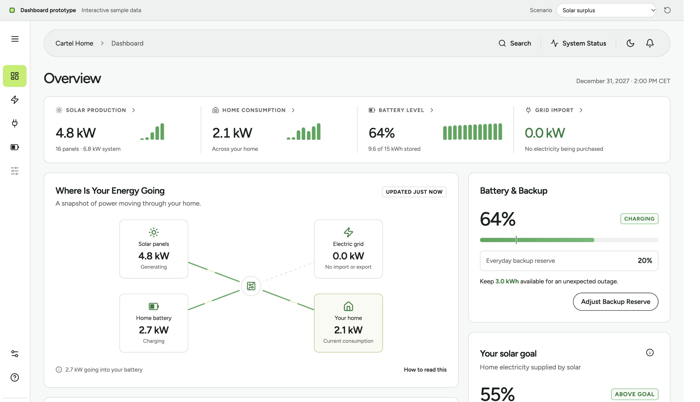
In the daytime scenario, solar covers current use and charges the battery. The same four-part layout makes the change easy to compare with the nighttime view.
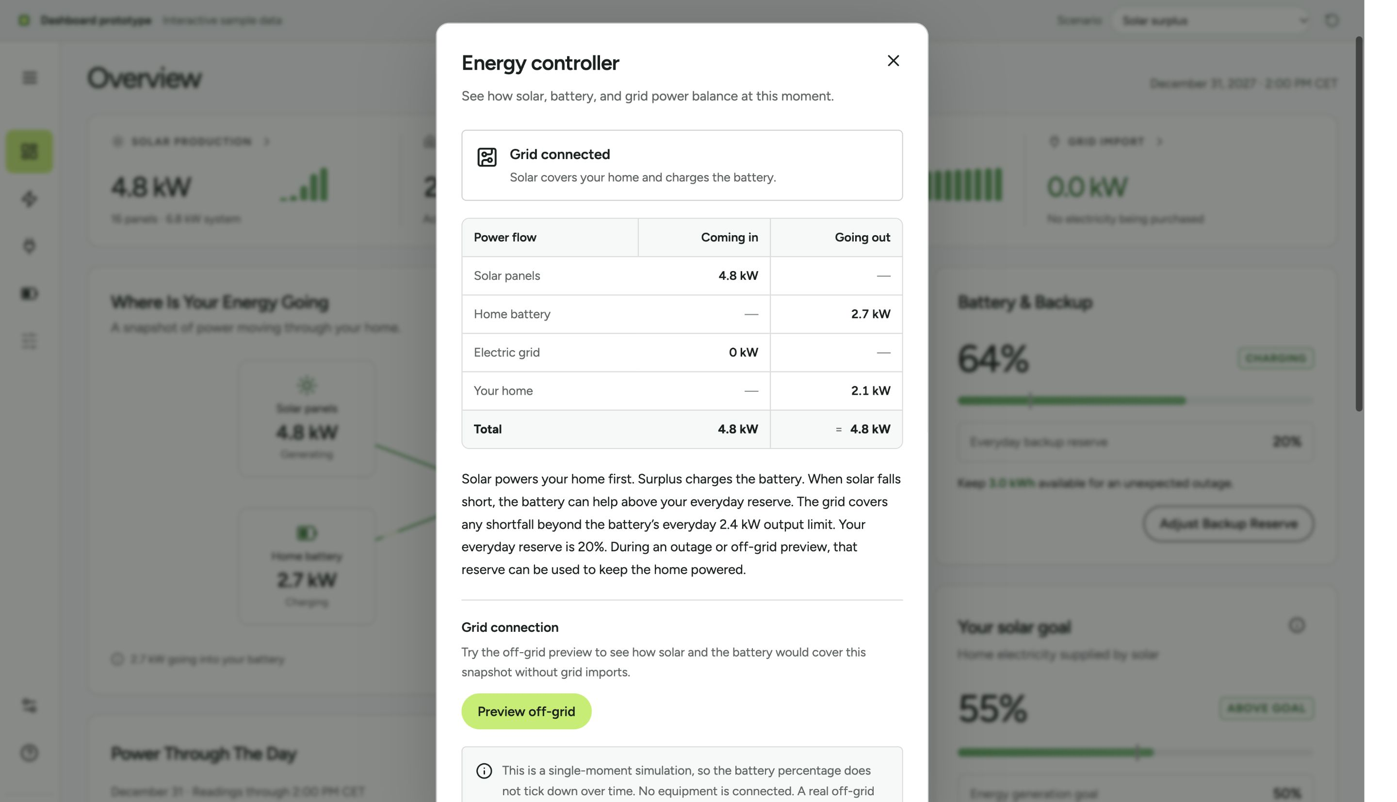
Selecting the controller opens a numeric balance: 4.8 kW from solar equals 2.1 kW used by the home plus 2.7 kW charging the battery. The dialog also explains the everyday reserve and offers a simulated off-grid preview.
Make backup choices understandable
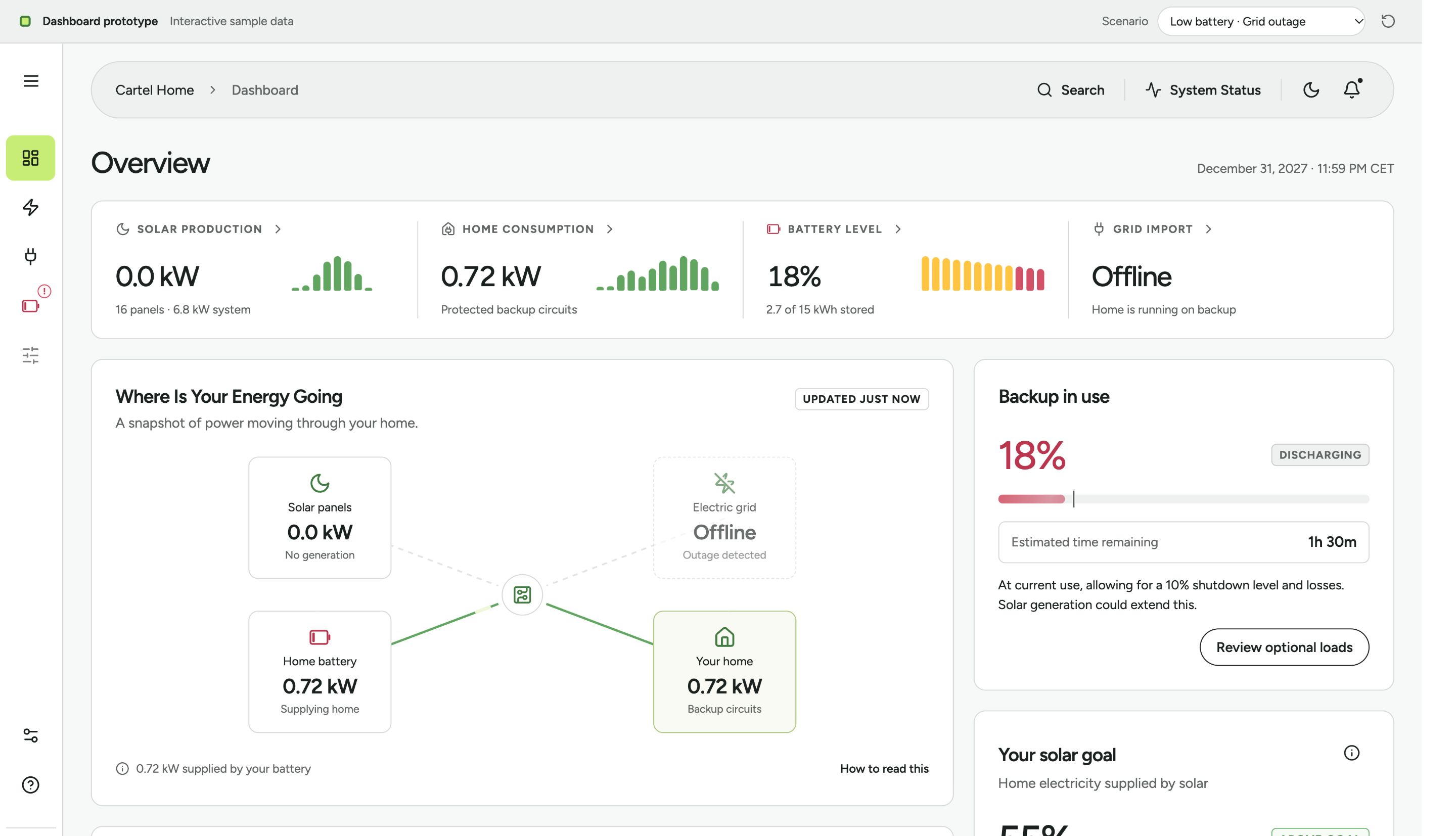
When the sample grid goes offline, the dashboard shifts attention to protected circuits, current battery use, and estimated time remaining. The user can review optional loads to see how reducing them changes the estimate.
The estimate uses energy above a sample shutdown floor and assumes constant demand with no additional solar. I present it as guidance for this simulation, not as a guarantee for a real home.
Introduce the system one choice at a time
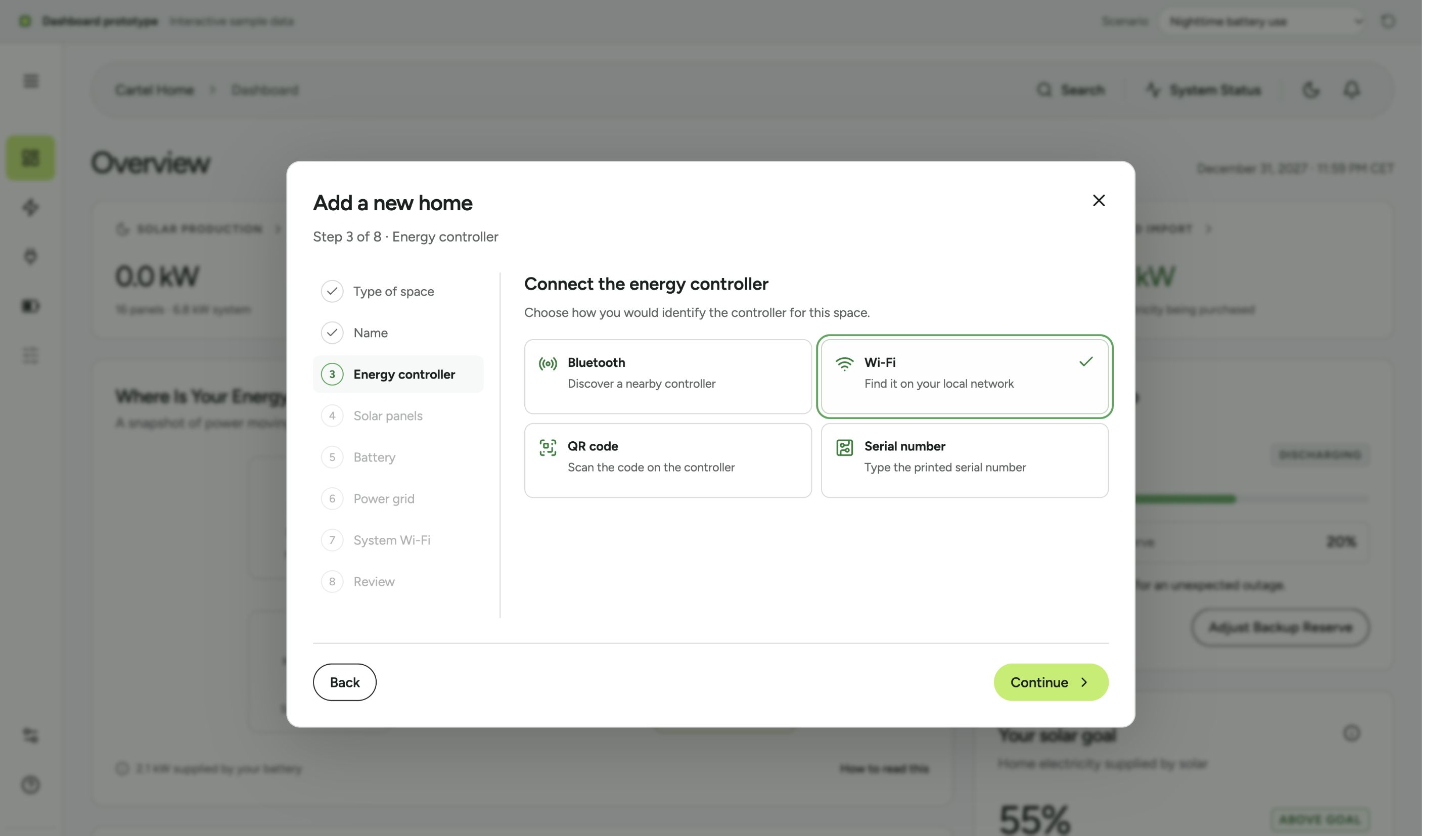
The add-home flow starts with the type and name of a space, then asks how a controller would be identified and whether solar, battery, grid, and system Wi-Fi are present. People can review earlier steps before creating a sample home.
A new home starts with its recorded setup and devices instead of invented live readings. The flow demonstrates the intended cross-brand experience; it does not pair real hardware.
What the prototype demonstrates
Reviewers can switch between five energy scenarios, inspect a power balance, change a backup reserve, explore device controls, and add a sample home. The responsive interface also offers light and dark themes and supports reduced motion.
This is a design exploration. There are no measured energy savings, customer outcomes, connected devices, or formal user-research results.
What I would validate next
- Can people understand the difference between current power, stored energy, and energy used over time?
- Do reserve and outage estimates support sensible decisions without implying certainty?
- Can households complete setup across different equipment types and identify missing data?
Try the prototype
Use the scenario selector above the dashboard to compare nighttime battery use, solar surplus, higher consumption, storm preparation, and a low-battery outage. Choose the home name to try the add-home flow.
Open energy.misnikas.com ↗All interactions are simulated and reset when the page reloads.