Multi-Product Design System
A reusable design system for enterprise software. It helps teams create consistent interfaces and adapt them to each product’s needs.
Different products. Repeated problems.
Teams repeatedly designed solutions to the same interface problems. Older applications looked and behaved differently. Limited budgets for minimum viable products (MVPs) left little time to improve shared components and standards.
The goal was a reusable design system that supported multiple products and their different workflows.
My contribution
I defined the visual style, reviewed existing interfaces, and built a shared component library around recurring needs. I guided other designers, reviewed components and documentation, and presented the work to stakeholders. I worked with the Portfolio Lead and project manager to set priorities, plan work, and help teams adopt the system.
My Working Process
Review existing interfaces → identify recurring needs with product teams → prioritize shared components → refine the library → support adoption and maintenance.
I prioritized components needed across products, starting with buttons, fields, navigation, tables, and dialogs. When the initial token model became too complicated, we simplified it so teams could adapt themes without rebuilding components. The resulting system was used across at least 30 products; library usage and team feedback guided ongoing improvements.
Start with what teams actually need
I reviewed the products we could access and spoke with designers, product owners, and managers. Repeated needs shaped the first release: buttons, fields, navigation, tables, and dialogs.
We prioritized components that could work across products, then expanded the library as real use cases exposed gaps.
- Components
- 40
- Reusable patterns
- 8
- Icons
- 300+
Apply the system to a complete screen
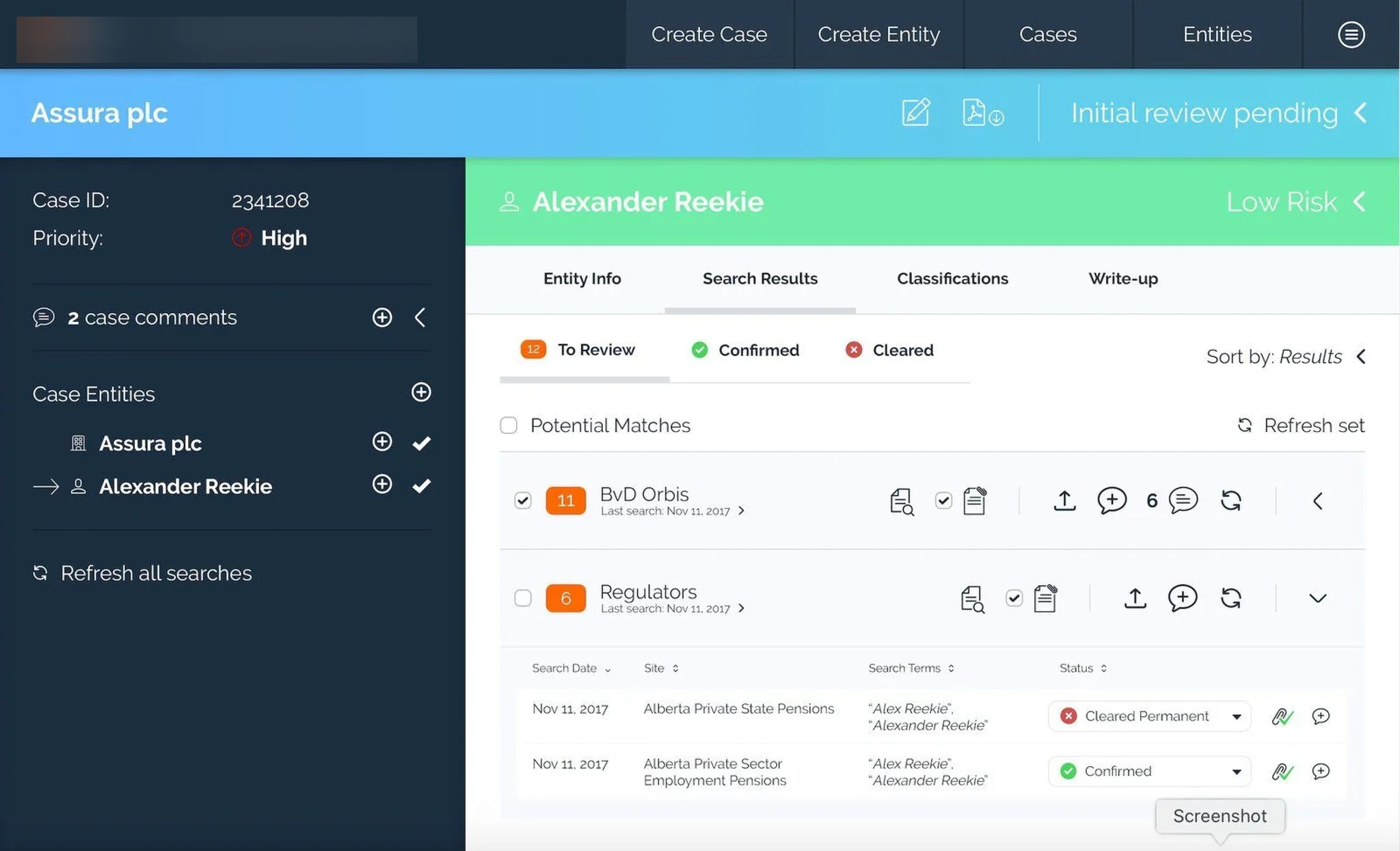
I used an enterprise interface found online as the starting point for a design exercise. I reworked its layout and sample content using the system’s components to create the SunshineAuto example below.
This independent design exercise shows how shared components can organize a screen with a large amount of information.
Before · External reference
After · SunshineAuto redesign exercise
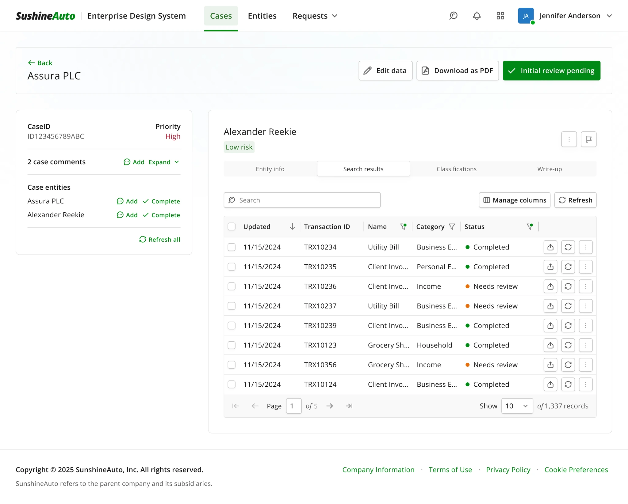
Organize the information
Use consistent spacing and neutral backgrounds to separate page actions, the case summary, and the main workspace.
Make actions explicit
Pair frequently used actions with text labels and group them near the content they affect.
Reuse shared components
Compose the screen from shared navigation, buttons, tabs, status labels, and table components.
Separate visual choices from component logic
I organized colors into design tokens: named values for uses such as text, backgrounds, and primary actions. Components used these tokens instead of fixed colors, so teams could change a brand’s colors without rebuilding the components.
The first token model became too complicated. We simplified and unified it so the system was easier to understand and maintain.
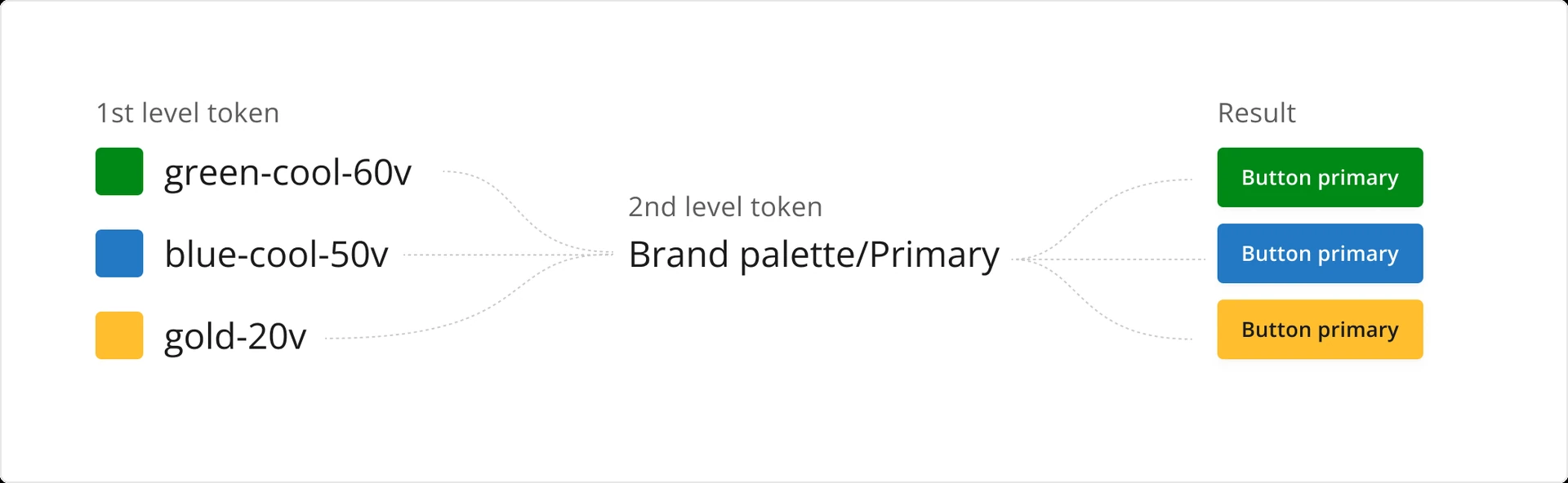
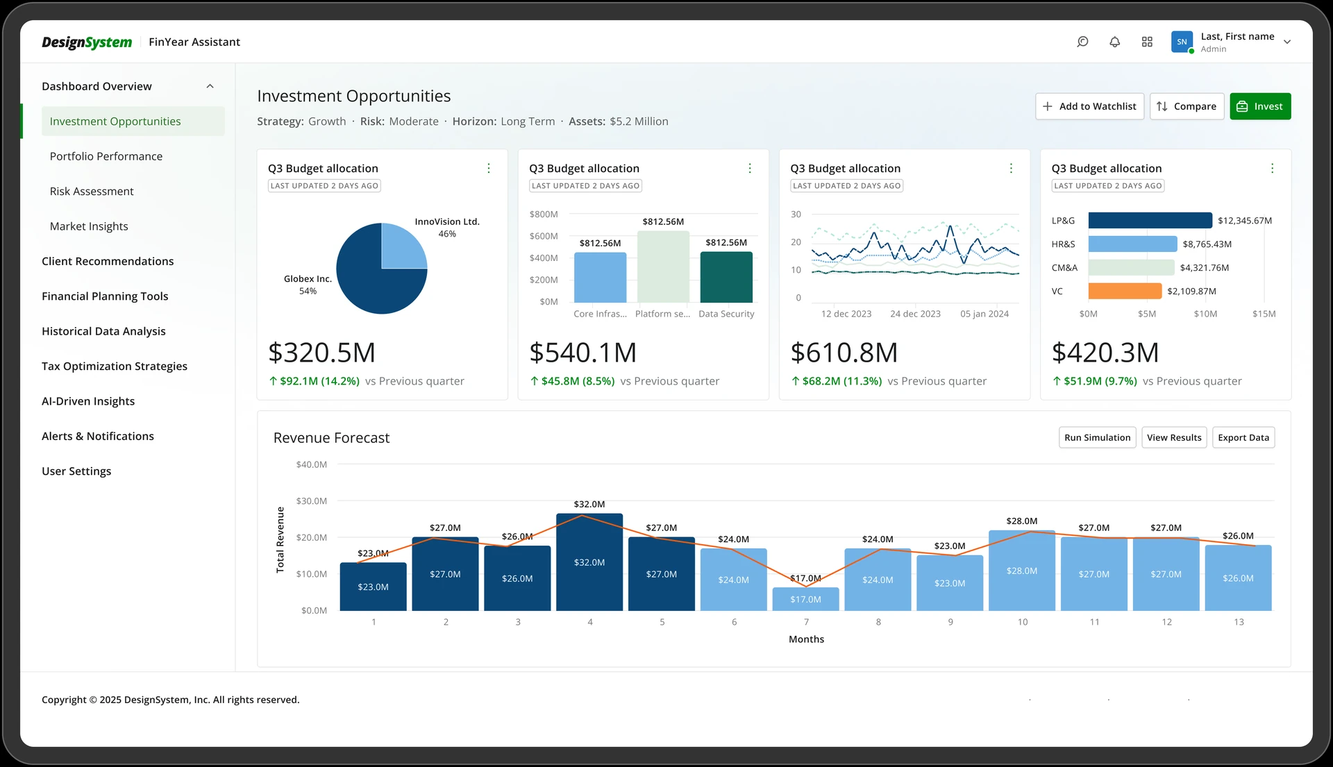
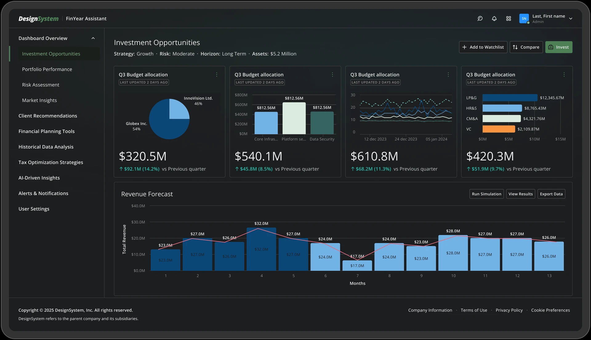
One structure, different themes
Light and dark modes used the same components and layout. Color tokens defined backgrounds, text, and component states for each theme.
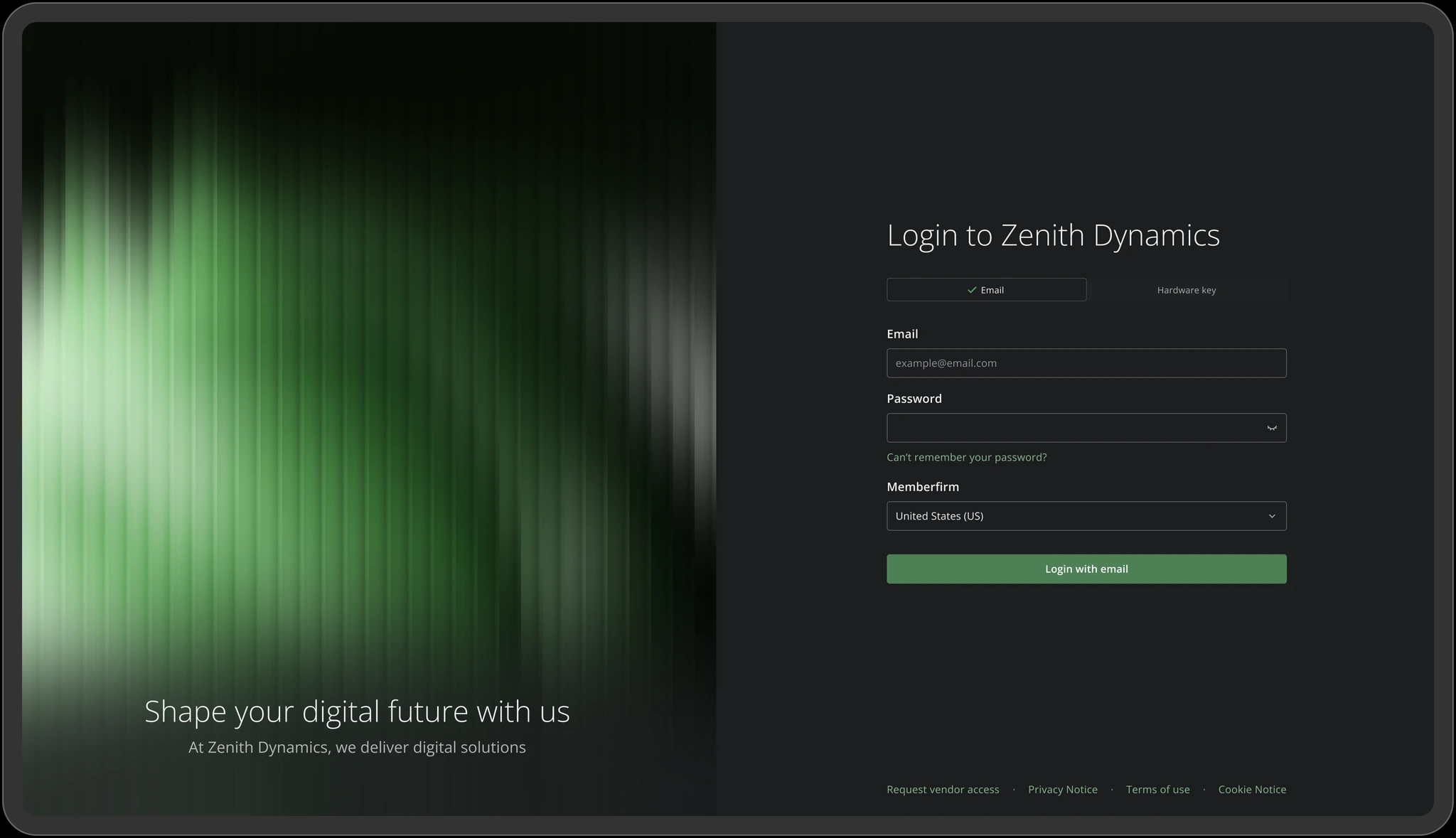
Adapt the system to each brand
This sign-in concept combines the system’s dark theme, form controls, and primary action with a more expressive illustration. The shared components provide consistency while the imagery gives the page its own identity.
Support different screen sizes
The library began with desktop needs. As it grew, we introduced responsive modes for typography and spacing, alongside layout rules for smaller screens.
In this Figma demo, changing the screen width adjusts the text, spacing, and navigation. It shows how the system supports different screen sizes.
Give designers useful control
Designers needed to adapt components without breaking their connection to the shared library. We added properties and variables so they could change components without detaching and rebuilding them.
This tab component lets designers change labels and toggle icons while keeping its structure intact.
How we maintained the library
I helped establish review and documentation practices so the system could evolve beyond its initial release.
- Document decisions. Explain each component’s parts, variants, behavior, and intended use.
- Listen to product teams. Review recurring requests and component problems through regular feedback.
- Prioritize shared needs. Look for a need across three cases before expanding the library, with exceptions for critical fixes.
The library brings components, patterns, and guidance into one organized resource. This recording scrolls through its page structure.
How teams used the design system
The system was used across at least 30 products within a portfolio of up to 50. I designed 10 products myself and collaborated with my team on another 20. Shared components, patterns, tokens, and guidance helped teams build consistent interfaces.
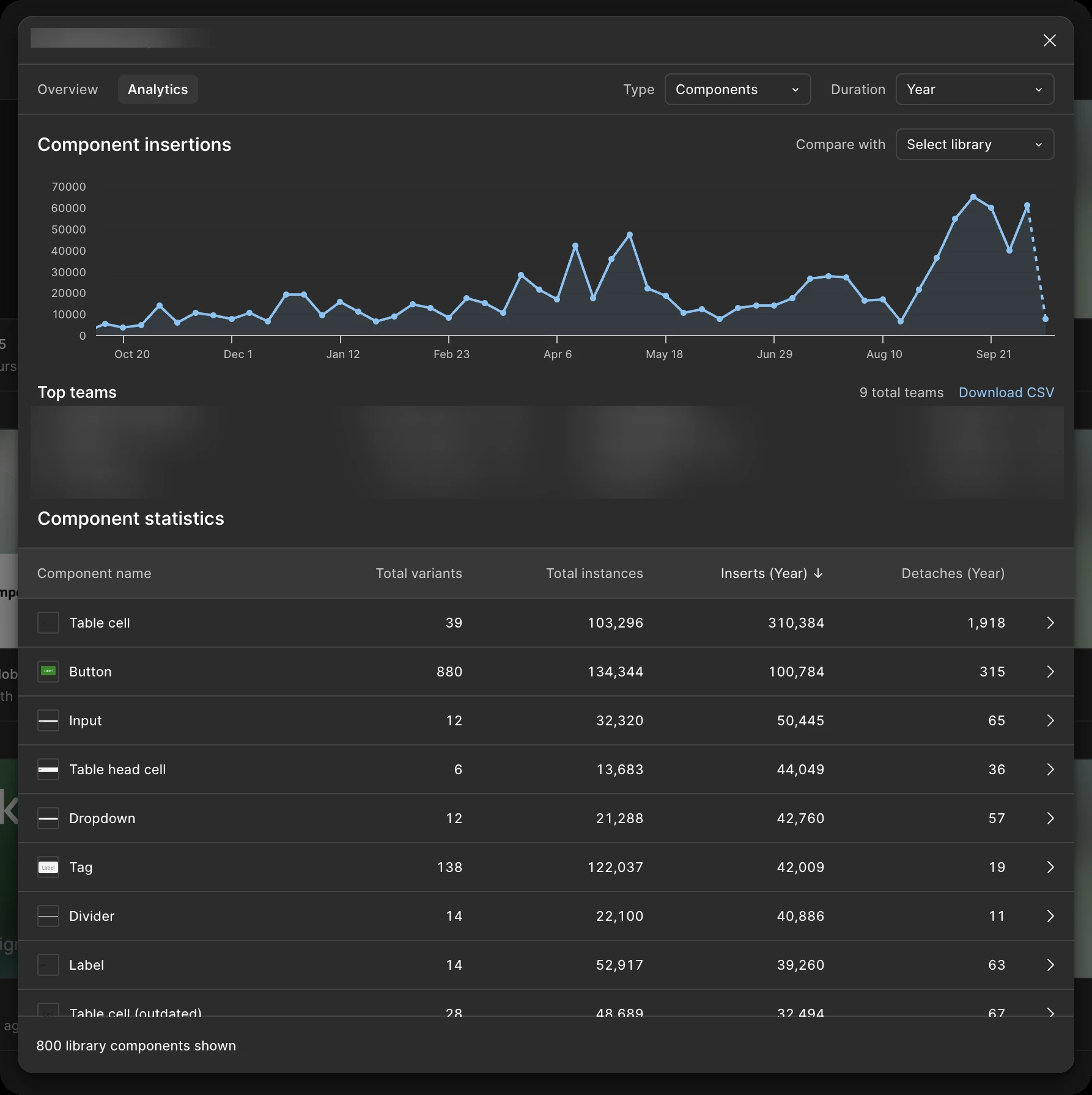
Figma library analytics showed how teams used components. Frequent detachments, including table cells, indicated where components might need more flexibility or clearer guidance.
I treated adoption as ongoing work: helping teams use the library, reviewing feedback, and improving shared components.
What I would carry forward
Validate across products early
Test a small foundation in several real products before expanding the component inventory.
Plan for smaller screens sooner
Include responsive behavior in the foundations, even when the first product is desktop-focused.
Align design and engineering
Agree on framework constraints, ownership, and release practices early so the library remains practical to implement.